
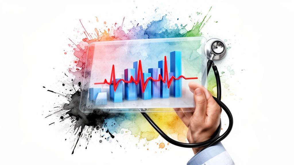

Healthcare Data Visualization for Better Patient Outcomes
Trying to make sense of raw medical data: endless spreadsheets filled with lab results, patient records, and operational logs, is like trying to navigate a foreign city without a map. Healthcare data visualization is that map. It translates overwhelming, complex information into clear, intuitive dashboards and charts that tell a story, connecting the dots between meaningless numbers and life-saving decisions.

From Complex Data to Clearer Diagnoses
Today’s healthcare world is flooded with data. Information pours in from every corner: electronic health records (EHRs), wearable fitness trackers, lab systems, and billing software. The sheer volume can be staggering. But in its raw form, this data is often just noise, making it nearly impossible for busy professionals to use effectively. This is where data visualization stops being a luxury and becomes an absolute necessity.
It’s all about turning dense datasets into visual stories through charts, graphs, and heatmaps. This simple shift allows clinicians, hospital administrators, and researchers to instantly spot patterns, trends, and anomalies that would otherwise be lost in a sea of numbers. Essentially, you’re giving the data a voice, making it understandable at a glance. To get there, you need the right tools; powerful healthcare data analytics solutions are the engine that drives this transformation.
Why Visuals Matter in Healthcare
It’s a well-known fact that the human brain processes visual information 60,000 times faster than plain text. In a hospital or clinic, where every second can make a difference, that speed is critical. It’s the gap between a timely intervention and a missed opportunity.
Well-designed visuals provide “at-a-glance” insights that have a direct impact on:
-
Improved Patient Care: A doctor can quickly scan a patient’s vitals over time, see how they’re responding to treatment, and flag at-risk individuals before their condition becomes critical.
-
Operational Efficiency: An administrator can look at a dashboard and immediately understand patient flow, bed occupancy, and staffing levels, making it easier to reduce wait times and cut down on waste.
-
Enhanced Financial Health: By visualizing the entire revenue cycle, finance teams can pinpoint bottlenecks in billing, identify common reasons for claim denials, and improve the organization’s bottom line.
By converting raw data into an intuitive visual format, healthcare organizations empower their teams to make faster, more informed decisions. This isn’t just about creating pretty charts; it’s about delivering actionable intelligence at the point of care and across the entire enterprise.
This move toward visual-first analytics is at the heart of modern digital health. An experienced healthtech solutions partner can be invaluable here, helping to build and roll out systems that are not only powerful but genuinely easy for the people on the front lines to use. The ultimate goal is to get data into the hands of everyone who needs it, from the ICU nurse to the CFO, and build a culture where smart, data-driven decisions are the norm.
Real-World Applications in Clinical and Business Settings
The real value of healthcare data visualization comes alive when it moves from theory into the day-to-day reality of hospitals and clinics. This isn’t about making data look pretty; it’s about getting the right information to the right person, right when they need it, in a way they can immediately understand.

On the clinical floor, these tools act like a co-pilot for doctors and nurses. They translate endless streams of patient data: numbers, notes, and alerts, into clear, intuitive dashboards that guide critical decisions in the moment. This is where the technology makes its most profound difference, directly impacting patient safety and outcomes.
Driving Better Clinical Decisions
Picture a nurse in a busy intensive care unit. Instead of digging through text-heavy charts, they glance at a dashboard showing real-time vitals for every patient. A sudden drop in blood oxygen or an irregular heartbeat is no longer just a number buried in a log. It’s a bright red alert on a screen, triggering an immediate response.
Here are a few key clinical applications:
-
Real-Time Patient Monitoring: Dashboards pull in live data from patient monitors, letting clinicians track vitals, lab results, and medication responses all at once.
-
Disease Hotspot Mapping: Public health teams use geospatial maps to watch an outbreak spread, pinpointing high-risk areas so they can direct resources where they’re needed most.
-
Comprehensive ‘Patient 360’ Views: This is arguably the most powerful application. It pulls a patient’s entire story: EHR data, lab results, info from wearable devices, and treatment history, into a single, interactive screen.
These ‘Patient 360’ views are the foundation of modern personalized care. By unifying data into one place, health systems have been able to cut avoidable readmissions by 20-30%. As more care moves to the outpatient setting, these visualizations help teams spot risks earlier using dynamic timelines and risk heat maps, which are essential for coordinating care across different providers.
Creating this kind of holistic view is a game-changer, but it all starts with connecting your systems. As we explored in our guide on hospital system integration services, this is the first and most critical step.
Optimizing Healthcare Business Operations
Beyond the patient’s bedside, data visualization is just as crucial for running the business of healthcare. Administrators are under constant pressure to improve efficiency, control costs, and keep the organization financially healthy. Visual dashboards give them the clarity needed to navigate the complexities of a modern health system.
Visualization gives administrators a command center view of their entire operation. It turns operational chaos into a set of manageable, measurable, and improvable processes.
For example, by visually tracking key performance indicators (KPIs), leaders can make informed, strategic adjustments that ripple positively throughout the organization. A skilled healthcare software development partner can build custom tools to solve these exact challenges.
Operational dashboards typically focus on:
-
Resource Management: Visualizing things like bed occupancy, operating room schedules, and equipment usage helps admins get the most out of their assets and cut down on patient wait times.
-
Staffing Optimization: Heat maps can show patient loads by department and time of day. This allows managers to build smarter schedules, preventing burnout from understaffing or waste from overstaffing.
-
Supply Chain Tracking: Interactive charts give a real-time view of critical inventory, from medications to PPE, making sure supplies are always on hand without tying up cash in overstocked storerooms.
-
Revenue Cycle Management: By mapping the entire financial journey from patient registration to final payment, leaders can quickly spot bottlenecks, lower claim denial rates, and improve cash flow.
Core Principles for Designing Effective Visualizations
It’s tempting to just dump raw data into a charting tool and call it a day, but that approach almost always creates confusion, not clarity. Building a truly effective healthcare data visualization isn’t an automated task; it’s a design discipline. It takes careful thought to create dashboards that are not just insightful but also immediately useful to busy professionals.
The real goal is to turn dense, complex information into a picture that someone can grasp in a few seconds. Every single thing on that screen: the charts, the colors, the labels, has to earn its place. If it doesn’t add to the story, it’s just noise, and in healthcare, noise can delay critical decisions.
Choose the Right Chart for the Right Data
The most fundamental step is picking the right type of chart to tell your data’s story. The wrong choice won’t just be confusing; it can actively misrepresent the facts or hide the one insight you were looking for. Each chart type has a job, and matching it to your data’s purpose is where good design begins.
Here are a few common pairings you’ll see in healthcare analytics:
-
Line Charts: Perfect for tracking changes over time. Think of monitoring a patient’s blood pressure readings over 24 hours or charting monthly hospital admission rates to spot a trend.
-
Bar Charts: These are your go-to for comparing different groups. You can use them to see how patient satisfaction scores stack up across hospital departments or compare the number of procedures performed by different surgeons.
-
Heat Maps: Great for showing concentration or risk across a big dataset. A heat map can instantly highlight which patient groups are at the highest risk for a certain condition or reveal staffing gaps across different shifts and units.
-
Scatter Plots: Use these when you want to see if two numbers are related. A scatter plot could help you figure out if there’s a link between a patient’s age and their length of stay in the hospital.
Design for Clarity and Eliminate ‘Chart Junk’
Once you’ve picked the right chart, the next step is to ruthlessly simplify. The data visualization expert Edward Tufte coined the term “chart junk” to describe any visual fluff that isn’t essential to understanding the data; things like distracting 3D effects, heavy gridlines, or decorative fonts. They just get in the way.
A great healthcare dashboard isn’t defined by what you add, but by what you thoughtfully remove. The goal is to achieve the highest ratio of data to ink, ensuring every pixel is working to convey information.
Clarity also comes from context. The number “85%” is meaningless by itself. Is that 85% of a target? Is it better or worse than last year? A well-designed visual will have a clear title, simple labels, and reference points, like a target line or a historical average, to give the numbers meaning. Getting this right from the start is why many organizations partner with a team that specializes in custom software development, ensuring these design principles are built in from day one.
Tailor Visuals to the User
A single dashboard rarely serves everyone well. The information an ICU nurse needs to see is completely different from what a hospital CFO is looking for. This is where user-centric design becomes critical.
An ICU nurse, for example, needs a dashboard showing real-time clinical data. We’re talking live patient vitals, medication alerts, and lab results that require an immediate response. The design has to be built for at-a-glance understanding, with clear, color-coded warnings for urgent issues.
A hospital CFO, on the other hand, needs a high-level summary of financial and operational health. Their dashboard would focus on trends in the revenue cycle, claim denial rates, and departmental costs. Their perspective is strategic and long-term, not immediate and tactical.
Embed Security and Compliance into the Design
In healthcare, security isn’t just a feature you add at the end; it has to be a foundational part of the design process. Dashboards regularly handle Protected Health Information (PHI), so building for compliance with regulations like HIPAA and GDPR is non-negotiable.
This means design decisions have to be made with security in mind:
-
Data Anonymization: When data is used for broader analytics or research, it should be de-identified to completely protect patient privacy.
-
Role-Based Access Control (RBAC): The system must be built so that users can only see the data they are authorized to see. A billing clerk, for instance, should never have access to a patient’s clinical notes.
-
Secure Data Handling: All data must be encrypted, both when it’s being transmitted (in transit) and when it’s being stored (at rest), to prevent any unauthorized access.
Choosing Your Technology and Architecture Stack
Picking the right technology for your healthcare dashboards is a lot like an architect choosing materials for a new building. The choices you make here will define how strong, flexible, and future-proof your entire data visualization strategy will be. What you see on the screen is just the final piece of a much larger, carefully designed system.
Behind every insightful chart is a well-oiled data pipeline. It all starts with gathering raw information from dozens of places, think Electronic Health Records (EHRs), patient wearables, billing systems, and pharmacy logs. This data gets pulled into a central data warehouse or a data lake, where it’s cleaned up and organized. Only then does it get sent to the visualization tools that turn all those numbers into something a human can actually understand and act on.
The Big Decision: Buy vs. Build
One of the first forks in the road you’ll encounter is the classic “buy vs. build” debate. Should you go with an off-the-shelf Business Intelligence (BI) tool, or invest in building a custom solution from the ground up?
BI platforms like Tableau and Microsoft Power BI are popular for a reason. They give you powerful, user-friendly tools right out of the box. With drag-and-drop interfaces and pre-made templates, you can get dashboards up and running incredibly fast, often without needing a dedicated developer.
On the other side of the coin, building a custom solution with JavaScript libraries like D3.js or Chart.js gives you ultimate control. This route lets you create truly unique visualizations that are perfectly tailored to a specific clinical workflow or a unique business problem – something that pre-packaged tools can sometimes struggle with. As we’ve covered before, this kind of ground-up effort is a key part of effective digital health platform engineering.
This isn’t just a technical decision; it has major budget and strategic implications. With the healthcare analytics market projected to grow from USD 69.12 billion in 2026 to a staggering USD 263.36 billion by 2032, it’s clear the industry is betting big on getting this right.
BI Tools vs Custom Libraries for Healthcare Visualization
So, how do you choose? It really comes down to your organization’s specific priorities: speed, customization, cost, and in-house skills. This table breaks down the main trade-offs.
| Factor | BI Tools (e.g., Tableau, Power BI) | Custom Libraries (e.g., D3.js, Chart.js) |
|---|---|---|
| Speed to Deploy | Fast. Go from idea to a working dashboard in days or weeks, thanks to pre-built connectors and templates. | Slower. Requires a full development cycle, including design, coding, and testing, which takes more time. |
| Customization | Limited. You work within the platform’s constraints. Great for standard charts, but less ideal for highly unique visuals. | Unlimited. If you can dream it, you can build it. Create bespoke visualizations for any specialized need. |
| Skill Requirement | Low to Moderate. Business analysts and data-savvy staff can create powerful reports with minimal training. | High. You’ll need skilled front-end developers who are experts in JavaScript, APIs, and data integration. |
| Cost Structure | Predictable. Usually based on per-user subscription fees, making it easy to budget for. | Variable. A higher upfront investment in development, but no recurring license fees. Can be cheaper long-term. |
| Integration | Standardized. Comes with lots of built-in connectors for popular systems, but integrating with older or niche software can be tricky. | Highly Flexible. Can connect to virtually any data source or application using custom APIs for a perfect fit. |
Ultimately, there’s no single “best” choice – only the best choice for you. While BI tools are fantastic for getting quick wins and empowering business users, a custom-built dashboard might be the only way to truly meet complex clinical or operational demands.
The "buy vs. build" decision really boils down to your unique needs for speed, control, and available resources. A pre-built tool might be the perfect fit for one hospital, while a custom solution is a necessity for another.
The right tech stack is one that supports your organization's immediate goals while also being scalable enough for the future. For some, this might mean starting with a BI tool and building custom components later. For others aiming for a deeply integrated and unique platform from the start, working with specialized partners can help bridge the gap between an idea and a fully realized, secure, and high-performing system.
Using AI to Predict and Prescribe Better Outcomes
Standard healthcare data visualization is great for showing you what’s happening now or what has already taken place. But the real evolution happens when we start answering a much more powerful question: what’s going to happen next? This is where Artificial Intelligence (AI) and Machine Learning (ML) come in, transforming your dashboard from a simple rearview mirror into a forward-looking GPS for clinical and operational decisions.
By weaving in AI, dashboards stop being merely descriptive and become predictive and even prescriptive. They don't just report on the past; they forecast the future and can even suggest the best actions to take. This shift elevates data from a passive reporting tool into an active, intelligent guide.
From Reporting the Past to Predicting the Future
The true power of AI here lies in its ability to find subtle patterns in massive datasets – patterns no human could ever hope to spot on their own. A machine learning model can sift through thousands of patient records to identify the quiet, almost invisible markers that signal a high risk of a future health crisis. When these predictions are displayed visually, they become immediate, actionable insights for clinicians.
This is where advanced healthcare data visualization truly shines. Instead of just showing a patient's current vital signs, an AI-enhanced dashboard can display a predictive risk score. Artificial intelligence is a game-changer for processing huge volumes of health data, often acting as an AI assistant that supports clinical decisions and ultimately improves patient outcomes.
Just think about these powerful applications:
-
Predicting Patient Readmissions: An ML model can analyze a patient's history, current condition, and even social determinants of health to generate a simple "Readmission Risk" score. When this pops up as a color-coded alert on a dashboard, it prompts care teams to take preventive action before the patient is even discharged.
-
Forecasting Disease Outbreaks: AI algorithms can monitor public health data, social media chatter, and pharmacy sales to predict flu or other viral outbreaks weeks ahead of time. When shown on a geospatial map, this allows public health officials to allocate resources and staff proactively, not reactively.
-
Anticipating Patient Deterioration: In intensive care units, predictive analytics are making a life-or-death difference. Some models can forecast patient decline up to 48 hours before major symptoms appear, which can potentially reduce mortality rates by 15-20% in ICU settings.
Prescribing the Next Best Action
Going a step beyond just predicting a problem, prescriptive analytics recommends a specific course of action. It answers the question, "Okay, given this forecast, what should we do about it?" This is where AI becomes a true partner in the decision-making process, augmenting human expertise without trying to replace it.
Integrating AI doesn't just show you the problem on the horizon; it helps you navigate around it. It turns a warning into a clear, actionable plan.
Imagine an AI model that doesn't just flag a patient as high-risk for sepsis. It also recommends the most effective, evidence-based treatment protocol based on that specific patient's genetic markers and medical history. This guidance can be visualized directly within the EHR, simplifying incredibly complex decisions for busy doctors. As we explored in our guide on the role of artificial intelligence (AI) in healthcare, this topic is rich with potential.
Another exciting frontier is in medical imaging. AI models can scan an MRI or X-ray and visually highlight tiny areas of potential concern that might be missed by the human eye. The radiologist is still the final decision-maker, of course, but the AI serves as a tireless, highly trained second set of eyes, boosting both accuracy and speed.
Your Roadmap for Implementing Data Visualization
So, you’re ready to put healthcare data visualization to work. Where do you begin? It’s not about flipping a switch; it's about following a structured path that takes you from a great idea to a tool that your clinicians and staff will actually use and rely on. This roadmap is designed to help you navigate that process and see a real return on your investment.
The ultimate goal is to move beyond simply looking at what happened and start making smarter decisions about the future. Think of it as a progression from descriptive analytics (what happened) to predictive analytics (what will happen), and finally to prescriptive guidance (what should we do).

This evolution is at the heart of any mature data strategy. Your dashboards shouldn't just be reports; they should be decision-making engines.
A Phased Implementation Plan
One of the most common mistakes we see is organizations trying to boil the ocean. They jump into a massive development project without a clear strategy, and the result is often an expensive tool that nobody uses. A phased approach is your best defense against this, allowing you to build momentum and prove value every step of the way.
Here’s a six-step plan that has worked for countless healthcare organizations:
-
Define a Solvable Problem. Start small and get specific. "Improve efficiency" is a wish, not a plan. A much better starting point is a concrete goal, like "reduce patient wait times in the emergency department by 15%." A measurable target like this focuses the entire project and makes success easy to define.
-
Unify Your Data Sources. Your data is probably scattered everywhere: in the EHR, billing platforms, lab systems, and more. The next crucial task is to map out where this information lives and build a reliable pipeline to bring it all together. This stage of cleaning and standardizing data is often the heaviest lift, but your entire project depends on it.
-
Choose the Right Tools and Partners. You'll face a "build vs. buy" decision. Will an off-the-shelf BI tool do the job, or do you need custom software development to meet your unique needs? A good healthtech solutions partner can be invaluable here, offering the experience to help you pick the right tech stack and architecture.
-
Build a Functional Prototype (MVP). Resist the temptation to build the "perfect" dashboard from day one. Instead, develop a Minimum Viable Product (MVP) that solves the core problem you identified in step one. The goal is to get a working version into the hands of your users as quickly as possible.
-
Test, Iterate, and Gather Feedback. This is where the magic happens. Release the MVP to a small group of the actual end-users: the nurses, doctors, or administrators who will live with this tool every day. Listen intently to their feedback. What works? What's clunky? What’s missing? Use their real-world insights to refine the tool in short, iterative cycles.
-
Scale with Strong Governance. Once your visualization has proven its worth on a small scale, it's time to plan for a wider rollout. This isn't just about giving more people access. It means establishing clear data governance, creating training programs, and setting up a support system to manage the solution as it grows.
Following a roadmap like this helps you sidestep the common pitfalls and get to data-driven insights much faster.
Frequently Asked Questions
When you start digging into healthcare data visualization, a lot of questions pop up. It's a tricky area where technology, patient security, and clinical needs all have to work together. Here are some of the most common questions we hear from healthcare leaders.
What is the biggest challenge in healthcare data visualization?
Without a doubt, the single biggest challenge is data interoperability and quality. We see it all the time: critical information is locked away in separate, siloed systems. Your EHR, lab software, billing platform, and pharmacy systems often don't speak the same language.
Before you can build even one useful chart, you have to pull all that scattered data together, clean it up, and get it into a standard format. This is the hard, unglamorous work. It takes a clear data governance strategy and the right integration tools to create a single, reliable source of information everyone can trust. Everything else is built on this foundation.
How can we keep patient data secure in visualization tools?
Security can't be an afterthought; it has to be built in from day one. When you're dealing with protected health information (PHI), you absolutely have to get this right to comply with regulations like HIPAA.
Protecting patient data isn’t just about following the rules; it’s about earning trust. When clinicians and patients know their information is safe, it creates the confidence needed to build a truly data-driven culture.
Here are the non-negotiables for security:
-
Role-Based Access Control (RBAC): This is fundamental. It means people only see the data they are explicitly authorized to see. A doctor's view is different from a billing administrator's view, and the system has to enforce that.
-
End-to-End Encryption: Information must be encrypted at all times, whether it's moving across a network or sitting in a database. This is your main defense against unauthorized access.
-
Data Anonymization: For any analysis that doesn't require personal details, you should completely remove or de-identify all personally identifiable information. This is the best way to protect patient privacy for population-level studies.
Working with an experienced healthtech solutions partner who lives and breathes these compliance requirements is critical.
How does visualization directly improve patient outcomes?
This is where the magic happens. Good data visualization gives clinicians the power to make faster, smarter decisions right at the point of care by turning complex data into clear, immediate insights.
Think about it: a real-time dashboard can alert a nurse the second a patient's vitals start to trend downward, allowing for immediate intervention. A visual timeline of a patient's medical history can highlight long-term patterns that are nearly impossible to spot in dense, text-based records.
Even better, predictive dashboards can flag patients at high risk for conditions like sepsis or readmission. By layering in insights from our AI development services, you can shift from reactive to proactive care, preventing serious events before they happen. Exploring AI for your business can unlock even more transformative opportunities.
How do I measure the ROI of a data visualization project?
Measuring the return on investment (ROI) is essential for proving a project's value and securing future funding. The key is to tie your project back to the specific, measurable goals you set at the very beginning.
You can track both hard and soft ROI:
-
Hard ROI (Financial Metrics): These are the easiest to quantify. Look for a reduction in claim denials, decreased patient readmission rates (avoiding penalties), optimized staff scheduling leading to lower overtime costs, and shorter patient stays.
-
Soft ROI (Operational and Clinical Metrics): These are just as important but harder to put a dollar figure on. Track improvements in patient satisfaction scores, reduced clinician burnout, and faster diagnostic times. You can see powerful examples of these outcomes in our client cases.
By tracking these KPIs before and after implementation, you can build a clear picture of the project's impact.
Ready to turn your complex data into clear, actionable insights? Bridge Global offers expert healthcare software development to build secure, compliant, and impactful data visualization solutions.
About Upendra Jith
Upendrajith completed his Master's in English and has been a commercial content developer for the past three years. He's more inclined to develop content with a 'street-smart' delivery on topics such as technology, media, or anything he can get his hands on. He has a fixation on lyrics, dark poetry, media, technology, and flow arts.
View all posts by Upendra Jith →