

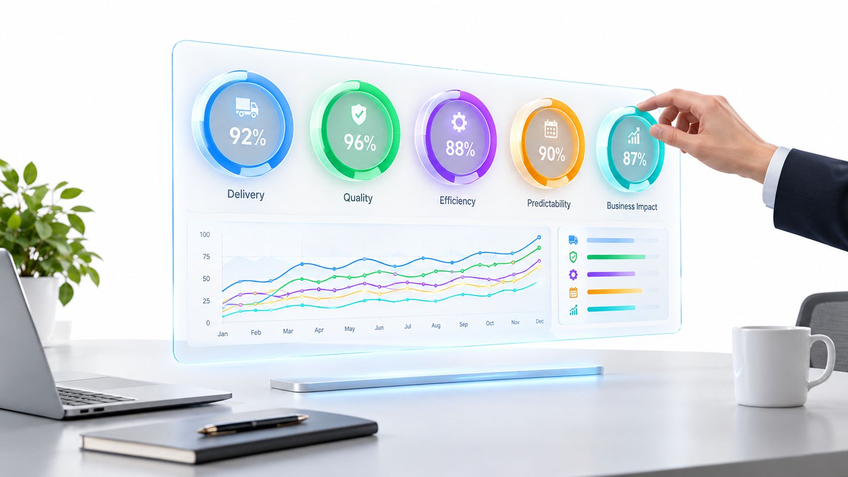

Software Development KPIs That Actually Drive Results
Your monthly engineering review is full of charts. Deployment counts are rising, sprint velocity looks stable, and the commit graph is busy. Yet nobody can answer the questions leadership cares about: Is the product safer? Are releases more predictable? Are customers adopting what the team ships? Did engineering reduce operational risk, or only produce more activity?
That's the problem with many software development KPIs. Teams measure motion instead of progress. A useful KPI system is an operating instrument, not a reporting archive. Each metric should help a named person decide where to invest, where to slow down, where to accept risk, or where to escalate.
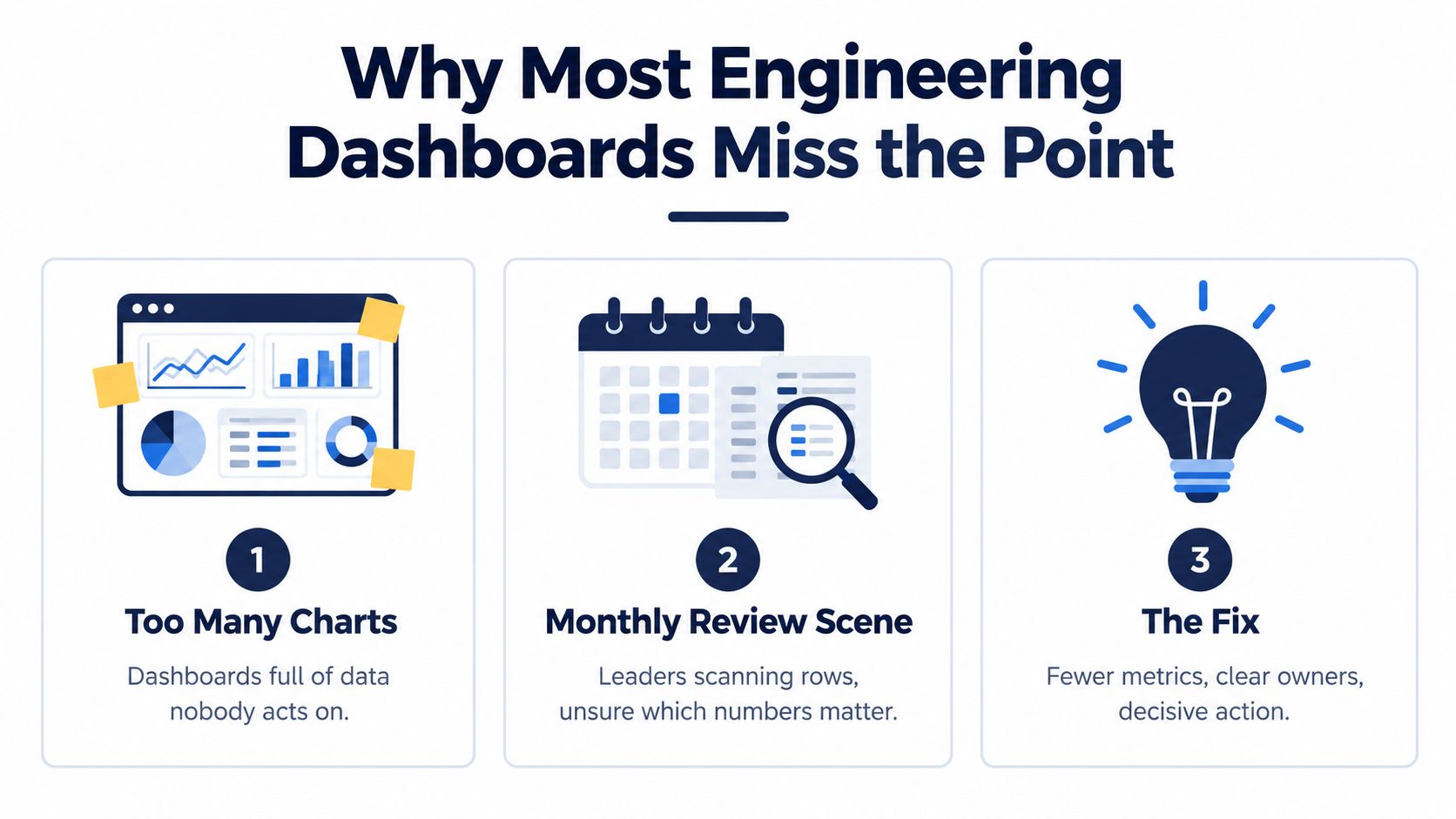
Why Most Engineering Dashboards Miss the Point
A typical review starts with a familiar sequence. An engineering manager presents deployment frequency, a product leader asks about velocity, finance asks whether delivery is on schedule, and security asks why a vulnerability remains open. The dashboard contains an answer for each question, but the answers sit in separate panels with different definitions, owners, and review cycles.
The result is a wall of healthy-looking numbers. A team may deploy frequently while increasing change failures. It may close more tickets while accumulating technical debt. It may hit a sprint commitment while shipping a feature that users don't adopt. A metric without a decision attached is decoration.
Replace vanity with operating signals
Ignore lines of code, raw commit counts, and tickets closed as standalone productivity measures. The peer-reviewed SPACE framework says productivity can't be represented by one metric or one dimension. It uses five dimensions: satisfaction and well-being, performance, activity, communication and collaboration, and efficiency and flow. The SPACE framework gives leaders a better test: does this signal explain an outcome, a constraint, or a system condition?
A dashboard for a regulated product needs an even sharper discipline. If nobody owns audit-trail completeness, vulnerability remediation time, or release evidence, those metrics won't protect the organization. A missed signal can appear later as an audit finding, a delayed launch, or an avoidable production incident.
Practical rule: Every dashboard metric must answer a question that a named person has agreed to act on.
Start with the decision, not the metric. The chief technology officer may need to decide whether to fund platform work. The product leader may need to decide whether to change scope. The engineering manager may need to decide whether to reduce work in progress. The risk owner may need to decide whether a release can proceed. A strong KPI system makes those decisions visible and ties them to evidence.
The Five Lenses Every Software Development KPI Should Cover
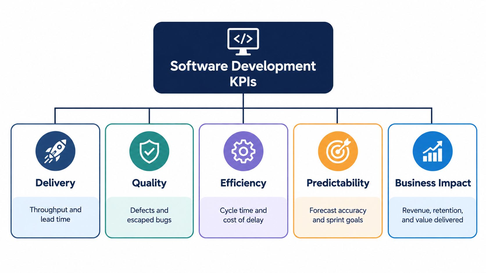
A useful metric tree has five lenses, each answering a different management question. Don't collapse them into one engineering score. A release can be fast but unstable, efficient but strategically irrelevant, or predictable but harmful to user trust.
Delivery
Delivery measures how work moves from change to usable release. Deployment frequency and lead time for changes belong here. The decision is whether the delivery system can respond quickly enough to product and customer needs without relying on heroic effort.
DORA defines deployment frequency as how often application changes reach production and lead time for changes as the elapsed time from a change being committed to version control until it is deployed. DORA's metric history provides the event definitions needed to make comparisons meaningful.
Quality
Quality asks whether the team is creating dependable software. Change failure rate, escaped-defect rate, fault density, incident load, and service-level indicators belong in this lens. These measures tell you whether speed is producing value or transferring work into support, remediation, and customer complaints.
Efficiency
Efficiency describes friction inside the workflow. Review turnaround, build-wait time, dependency delay, and time spent in queues reveal where engineers lose flow. Don't interpret efficiency as individual busyness. A shorter review queue can help an entire team, while a higher personal activity count may just indicate fragmented work.
Predictability
Predictability measures whether commitments mean anything. Compare planned scope with delivered scope, milestone forecasts with actual completion, and release readiness with the agreed date. This lens supports portfolio decisions, staffing, customer communication, and risk management.
Business impact
Business impact connects engineering work to outcomes. Depending on the product, that may include adoption, retention, conversion, clinical workflow time saved, denied-claim reduction, or operating cost. A dashboard with delivery numbers but no business-impact line reports motion, not progress.
For a healthtech product, the metric tree may run from deployment lead time to defect escape, then to audit evidence and clinical workflow performance. For a SaaS product, it may connect release quality to adoption and retention. The structure changes with the business, but the principle doesn't: each lens must remain visible, and none should be averaged into a misleading score.
Formulas and Data Sources for the Metrics That Matter
A metric is useless if two teams can produce two different answers from the same release. Lock the definition before you publish the chart: start event, end event, population, time window, exclusions, and the owner responsible for the query.
DORA stays valuable because the formulas are simple and the instrumentation is concrete. Deployment frequency comes from successful production deployment events. Lead time for changes is the elapsed time between a code change entering the delivery stream and that change reaching production, usually by joining version-control data to deployment records. Change failure rate is failed production changes divided by total production changes, using rollback records, hotfixes, and incident data to define failure consistently. Recovery time runs from incident detection to confirmed service restoration.
| Metric | Formula | Primary Data Source |
|---|---|---|
| Deployment frequency | Successful production deployments ÷ measurement period | CI/CD deployment events |
| Lead time for changes | Deployment timestamp minus commit timestamp | Version control joined to deployment logs |
| Change failure rate | Failed deployments ÷ total deployments | CI/CD, incident, rollback, and hotfix records |
| Recovery time | Service restoration timestamp minus incident detection timestamp | Incident management and observability tools |
| Fault density | Unique faults in a specified interval ÷ thousands of lines of code | Defect tracker, release data, and code inventory |
The 2024 DORA research also introduced deployment rework rate, a measure of how much deployment activity is spent on unplanned work such as bug fixes. Track it. High release volume can hide a team that is mostly repairing yesterday's changes.
Use SPACE alongside DORA because delivery speed alone misses important failure modes. Satisfaction and well-being come from recurring team surveys. Performance should include system or customer outcomes. Activity can describe output, but it should never become an individual leaderboard. Communication, collaboration, efficiency, and flow are better captured through review cycles, blocked work, queue time, and dependency delays.
If you want practical examples of instrumentation choices, compare how Fundl measures software delivery with this software development productivity metrics guide. The useful pattern in both is the same: combine delivery, quality, and workflow signals instead of pretending output volume equals productivity.
Trend quality, not just incident totals
Fault density is only helpful when you use it carefully. The measure is unique faults in a defined interval divided by thousands of lines of code, a software-quality formulation described in NIST software quality guidance on fault density. Trend it by severity and by release. Segment it by work criticality too. A low-risk UI change and a regulated workflow change should not roll up into one reassuring average.
That same segmentation matters even more with AI-assisted code. Keep AI-generated changes identifiable in your delivery data, then compare rework, escaped defects, and review outcomes against non-AI changes within the same risk tier. Otherwise, you will argue about AI with anecdotes instead of evidence.
Every KPI in this section should resolve back to a system of record: a deployment event, an incident timestamp, a defect entry, a code inventory, or a survey response. If nobody can show the query, the metric does not belong on the dashboard.
Setting Targets Without Setting Yourself Up to Fail
A single benchmark for every team is a management mistake. A low-risk ecommerce experiment and a clinical release shouldn't share identical speed targets, review gates, or tolerance for failure. Criticality must shape the target.
For a SaaS product, a team may prioritize short lead time and frequent small releases for low-risk changes. A customer-facing billing change needs stronger validation and a closer look at failure rate. A regulated healthtech release may require evidence that requirements, tests, vulnerabilities, and audit records are complete before deployment.
Use ranges and inequalities
Google's SRE guidance distinguishes an SLI, the quantitative measure, from an SLO, the target applied to that measure, and an error budget, the amount of SLO miss the organization is willing to tolerate. Google's SRE guidance on service-level objectives recommends reviewing violations against the available budget and using the remaining budget in release decisions.
Write the target as an explicit inequality:
Service latency: SLI ≤ target.
Availability: SLI ≥ lower bound.
Audit evidence: completed evidence ≥ required threshold.
Change failure: SLI ≤ accepted limit for the work tier.
The exact target belongs to your baseline, service contract, risk assessment, and customer expectation. Don't copy an “elite” benchmark and call it a strategy. An aggressive target can encourage unsafe shortcuts, while a lax target can normalize avoidable failure.

When the error budget is exhausted, pause discretionary releases and prioritize reliability, remediation, or evidence completion. That rule turns a dashboard into governance. It also prevents leadership from averaging together availability, denied-claim reduction, and audit-trail completeness as though they were interchangeable.
A healthtech portfolio should report clinical workflow impact separately from deployment health. A finance platform should keep claims accuracy, control-test results, and vulnerability remediation visible alongside delivery flow. Segment the work first, then set the target.
A Practical Implementation Sequence for Your KPI System
Treat KPI design as a delivery project. Start small, ship a usable version, and improve the instrumentation when leaders discover a decision the dashboard can't support.

Six steps that prevent dashboard sprawl
Inventory current metrics: List every chart, spreadsheet, report, and manually maintained number. Retire anything that has no owner or hasn't informed a decision.
Define the five lenses: Map each surviving metric to delivery, quality, efficiency, predictability, or business impact. Gaps are more valuable than extra charts.
Set targets by criticality: Establish a baseline before changing the process, then define a target range and an escalation rule for each work tier.
Build audience-specific dashboards: Give engineering a delivery-health panel, product a reliability and adoption panel, and risk leaders a compliance panel. One master dashboard usually serves nobody well.
Assign one owner: A metric can have many consumers, but it needs one steward responsible for definition, data quality, and review.
Review and iterate: Revisit definitions when the system changes, not only when a number looks bad. A metric that no longer informs a decision should be retired.
A one-page metric contract should record the formula, source systems, timestamp rules, exclusions, owner, target, escalation action, and review cadence. For example, a delivery-health row might read: “Lead time for changes, commit to production deployment, version control joined to CI/CD, owned by the engineering manager, reviewed weekly, segmented by service criticality.”
For a deeper management perspective, use this guide for engineering productivity leaders when deciding how team-level metrics should support improvement rather than surveillance.
Your first-week checklist is simple:
Name the decisions the dashboard must support.
Remove unowned metrics.
Define start and end events.
Capture a baseline without changing behavior.
Select one owner per KPI.
Publish the escalation action beside the target.
Rethinking KPIs for AI-Assisted Engineering
AI-assisted development exposes a gap in traditional measurement. DORA begins with a committed change and ends at production, but AI adds upstream work: prompt design, output validation, generated-code review, technical-debt cleanup, and cognitive load.
The 2024 DORA research reported that more than 75% of respondents used AI for at least one daily professional responsibility. It also associated a 25% increase in AI adoption with estimated gains in documentation quality of 7.5%, code quality of 3.4%, and code-review speed of 3.1%, while delivery throughput declined by an estimated 1.5% and delivery stability by 7.2%. The DORA findings support a clear conclusion: adoption isn't the outcome.
Track quality-adjusted flow instead:
AI-assisted versus unassisted merge rate.
Escaped-defect rate by code origin.
Review minutes per accepted change.
Rework caused by generated code.
Test coverage of AI-authored paths.
Time to human validation.
Review rejection reasons.
The survey evidence supplied for this topic reports that 94% of respondents said existing productivity metrics fail to track technical debt, validation time, or burnout; only 38% track time spent reviewing AI-generated code, while 53% identified AI-code accuracy review as unmeasured. The Pragmatic Engineer survey discussion also reports AI-assisted pull requests merged within 30 days at 32.7%, compared with 84.4% for unassisted pull requests.
Those figures don't justify banning AI. They justify measuring the hidden work.
Keep AI KPIs at team or system level, not as individual scorecards. Workers in the same survey reported fear of evaluation based on AI data at 54%, while 55% wanted greater transparency about the metrics used. Separate AI adoption analysis from performance reviews, disclose what you collect, and segment results by risk tier. For implementation guidance, see Bridge Global's article on AI for software development.
Connecting Engineering KPIs to Regulated Business Outcomes
A release ships on time, the dashboard stays green, and leadership still asks why claims accuracy slipped or why a clinical workflow got slower. That question exposes whether your KPI system works. Activity never proves business value. A traceable chain of evidence does.
Use four separate layers, then segment each one by work criticality.
Delivery health: Lead time, deployment frequency, recovery time, and rework.
Product reliability: Availability, performance, escaped defects, and error-budget consumption.
Risk and compliance: Audit-trail completeness, control-test pass rate, vulnerability remediation time, and requirements traceability.
Business outcome: Clinical workflow time saved, denied-claim reduction, conversion, retention, claims accuracy, or operating cost.
Do not average those layers into one score. A low-risk ecommerce test and a medical-device release should not share the same guardrails, thresholds, or interpretation. Teams that mix them usually hide risk in the average. Analysts behind The Benchmark report found that only 31% of organizations had a documented, board-visible framework linking engineering metrics to outcomes such as revenue, retention, or cost-to-serve. The same report found that 89% of engineering leaders saw improvement in tracked productivity after AI adoption, while 81% reported increased code-review time.
If you want a defensible outcome claim, instrument it before the release. Record the baseline. State the hypothesis. Define the affected population. Use a holdout or comparison when the product and regulatory context permit it. Assign one owner to each outcome metric, and preserve the evidence trail from deploy event to result.
Ask four questions every time. Which engineering change moved the outcome? Which users or workflows changed? What competing explanation still fits? Would the claim survive an audit or customer review?
Frequently Asked Questions About Software Development KPIs
How often should leaders review the dashboard?
Review operational signals weekly, business outcomes on the cadence appropriate to their feedback cycle, and metric definitions when ownership or system behavior changes. Daily review makes sense for an active error budget or incident response, but it creates fatigue when applied to every KPI. The owner should bring only exceptions, decisions, and trend changes to the meeting.
How do we stop productivity measurement becoming surveillance?
Measure teams and systems, not individual output. Don't rank developers by commits, lines of code, pull requests, or AI suggestions. The SPACE framework's five dimensions – satisfaction and well-being, performance, activity, communication and collaboration, and efficiency and flow – provide a better guardrail than an activity leaderboard. Tell employees what data you collect, why you collect it, and what decisions it won't support.
When should we retire a KPI?
Retire a metric when it no longer changes a decision, lacks a credible data source, or encourages behavior that harms quality. Record the reason, preserve historical data for context, and replace the metric only when the replacement has an owner and a defined action. A green number that nobody uses is not a success signal.
Which KPI should we add when everything looks green?
Add the missing lens, not another activity chart. If delivery, quality, efficiency, and predictability look healthy, inspect business impact. If business outcomes are strong but reliability is weak, add the risk signal before increasing release speed. When AI is involved, examine validation time and rework before celebrating higher output. The next KPI should expose an unmeasured decision or risk.
Bridge Global can help you design a KPI system around delivery health, reliability, compliance evidence, and business outcomes, then connect that system to custom software, healthcare, SaaS, or AI delivery work. Visit Bridge Global to discuss the engineering metrics and operating model your product needs.

About Preethi Saro Philip
Preethi Saro Philip is a Post Graduate Research Degree holder in Economics with more than 10 years of experience in writing, editing, research and teaching. She has an intense passion for content crafting and calls herself a ‘wordsmith’. She enjoys writing on wide-ranging topics including business, technology, health & lifestyle, education, environment etc.
View all posts by Preethi Saro Philip →