


Mastering Real-Time Healthcare Analytics Dashboards
By 2026, real-time healthcare analytics dashboards are projected to be critical infrastructure for over 78% of major U.S. hospital systems, a shift tied in part to a 45% reduction in average patient wait times when dashboards are integrated with EHRs. That number changes the conversation. Dashboards are no longer a reporting layer added after the fact. They've become part of how care operations run hour by hour.
What gets less attention is the difficult part. The reason for failure isn't typically picking the wrong chart type. Instead, failure arises when "real-time" breaks down as data arrives from EHRs, labs, scheduling, billing, claims, devices, and workforce systems that don't agree on timestamps, identifiers, or clinical context.
That's why the core question isn't whether real-time healthcare analytics dashboards are valuable. They are. The core question is whether your platform can keep data fresh, governed, and audit-ready without creating a compliance or operational mess.
The Shift to Proactive Healthcare
Modern care delivery runs on short decision windows. Bed status changes by the minute, staffing gaps open mid-shift, lab bottlenecks ripple into discharge delays, and denial patterns often surface long before a month-end review catches them. In that environment, delayed reporting creates operational blind spots.
Real-time healthcare analytics dashboards support a different model. They give clinical, operational, and financial teams a current operating view they can use during the shift, not after it. The hard part is not putting charts on a screen. It is getting source systems to agree on patient identity, event timing, encounter status, and workflow context well enough that teams trust what they see.
Why static reporting no longer works
Static BI helps with review cycles. Hospitals also need systems that support intervention while the event is still unfolding.
A weekly wait-time report may confirm that throughput slipped. An effective real-time dashboard should show whether the problem started at triage, lab turnaround, bed assignment, transport, discharge coordination, or a broken interface feeding stale timestamps into the queue logic. That level of visibility is what turns a dashboard from a reporting tool into an operating system for care delivery.
Three pressures usually force the shift:
Clinical response time: Teams need earlier visibility into deterioration risk, escalation signals, and capacity constraints.
Operational coordination: Leaders need one current picture of flow, staffing, and resource availability across departments.
Financial control: Revenue cycle teams need to spot denials, charge exceptions, and claim-handling issues while corrections are still practical.
Real-time visibility does not replace judgment. It shortens the feedback loop around judgment.
The health systems that get value from dashboards usually make one architectural decision early. They treat the dashboard as a governed product tied to workflows, alert rules, ownership, and audit requirements. They do not treat it as a prettier reporting layer. That approach matters because messy integration work decides whether the dashboard helps or harms operations. If ADT messages arrive late, device feeds drop fields, or billing and clinical systems classify the same encounter differently, the dashboard can push teams toward the wrong action with more confidence and speed.
That is why many organizations invest in custom healthcare software development for real-time analytics platforms when standard reporting tools cannot handle their integration complexity, role-based controls, or audit expectations.
Unlocking Value with Real-Time Use Cases
Real-time dashboards earn their budget when they change what staff do during the shift, not when they produce cleaner executive reporting a month later. In healthcare, the hard part is rarely choosing the use case. The hard part is getting enough source systems, timestamp logic, and governance rules aligned so the screen reflects operational reality instead of a delayed approximation.
In the Emergency Department
The emergency department is usually where the value becomes visible first. An ED manager needs a current view of arrivals, triage backlog, lab delays, bed assignment status, boarding time, and discharge bottlenecks in one workflow, with enough context to act. If lab turnaround is stable but boarding spikes after 3 p.m., the response is different than if intake volume is the constraint.
That only works if the underlying events are reconciled correctly. I have seen dashboards mark patients as waiting for beds when the ADT feed was late, and the transfer had already happened in the EHR. In a live environment, that kind of data lag creates the wrong escalation path, wastes staff time, and erodes trust quickly. For ED use cases, speed matters, but timestamp accuracy and encounter-state logic matter just as much.
For nursing and capacity management
Nursing leaders need a live operational view tied to staffing decisions inside the shift. A useful dashboard helps answer a narrow set of questions fast.
Acuity versus assigned coverage: Which units have drifted out of balance because the patient condition changed after the last staffing adjustment?
Bed status with operational blockers: Which beds are open, which are pending discharge, which are waiting on environmental services, and which are unavailable due to isolation or specialty constraints?
Escalation risk by unit: Where admissions, transfers, falls risk, or staffing gaps are building at the same time?
A static census board cannot do that well. A real-time dashboard can, but only if bed state definitions are standardized across departments, and someone owns exception handling when source systems disagree.
Practical rule: If a dashboard does not help a charge nurse reprioritize assignments before the next handoff, it is not ready for production.
In revenue cycle and network operations
The financial use cases are less visible than clinical response, but they often deliver ROI faster. Revenue cycle teams can watch denials, authorization gaps, charge exceptions, and claim-status changes as they emerge, then route follow-up while correction is still possible. Waiting for end-of-week reporting usually means the root cause has already spread across more encounters.
Network and referral operations use the same real-time model differently. They need to see where referrals stall, where patients drop out before scheduling, and where handoffs between locations break down. The engineering challenge is that these workflows often span EHR data, scheduling platforms, call center logs, and payer transactions that were never designed to line up cleanly.
That is why the most valuable use cases are rarely the flashiest ones. They are the ones where trusted, governed data shortens the gap between signal and intervention, and where every alert can be traced back to source records if compliance, finance, or clinical leadership asks for proof.
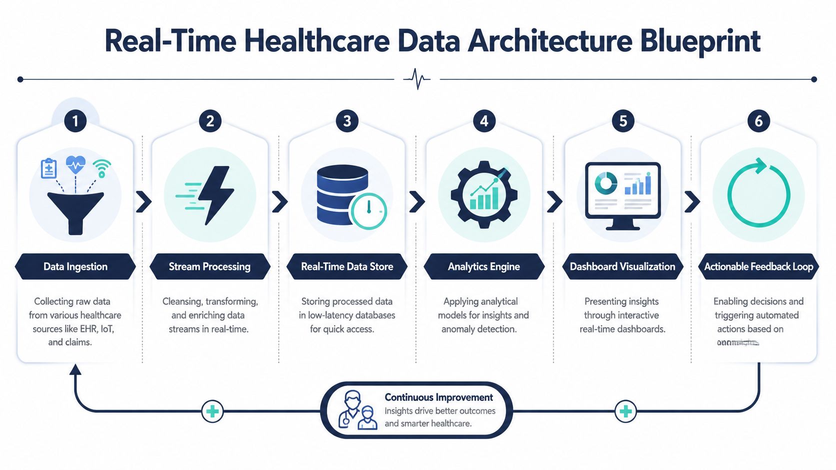
Designing the Data Architecture for Real-Time Insights
A real-time dashboard is only as real-time as its slowest upstream system. In healthcare, the hard part usually is not the charting screen. It is the integration stack that has to ingest, reconcile, govern, and serve data from systems that were never built to behave like a single platform.
Start with source reality
Teams usually begin with a clean architecture diagram and then hit the mess in week two. The EHR may publish ADT events quickly, while lab data arrives with a delay. A remote monitoring vendor may send device data every few seconds, but patient identity may only match back to the encounter after a batch update. Scheduling, billing, call center, and staffing systems often use different identifiers and different timestamp logic. “Real-time” becomes a coordination problem before it becomes a visualization problem.
The source mix usually includes core clinical systems, administrative platforms, connected devices, and operational tools. The challenge is not just collecting those feeds. The challenge is deciding which source is authoritative for each metric, how long data can be considered fresh, and what the dashboard should show when two systems disagree.
That decision work belongs in architecture, not in the report layer.
The pipeline decisions that actually matter
The ingestion pattern should match the clinical and operational risk of the use case. Some signals need event-driven processing. Others are fine on a five-minute refresh. Chasing sub-second latency everywhere increases cost and complexity without improving decisions. I have seen teams spend months reducing pipeline lag while leaving duplicate patient identities unresolved, which made the dashboard fast and untrustworthy at the same time.
Four layers usually determine whether the platform holds up in production:
Ingestion layer
Interface engines, APIs, CDC streams, file drops, and device connectors collect changes from source systems as they occur or on a defined interval.Normalization layer
Within this layer, teams map source codes, standardize units, align timestamps, reconcile patient and encounter identities, and apply data quality rules.Serving layer
Curated data lands in a store designed for low-latency queries and controlled metric definitions, not just retrospective reporting.Consumption layer
Dashboards, alerts, and downstream apps should read from governed business logic, so every team is using the same KPI definition.
Projects fail here when metric logic gets copied into dashboard formulas, ad hoc SQL, and application code. The result is drift. Bed occupancy, length of stay, or alert counts start to vary by team, and nobody can explain why without a manual trace through multiple systems.
A mature business intelligence implementation for healthcare operations treats semantic definitions as a managed asset, with version control, test cases, and named owners.
Build for reliability, auditability, and controlled failure
Speed matters. Reliability matters more.
Healthcare users need to know whether a number is current, where it came from, and who is allowed to see it. That means data contracts, schema versioning, retry logic, dead-letter queues, validation thresholds, late-arriving data handling, and exception workflows. Those controls are not overhead. They are the difference between a dashboard that supports action and one that creates escalations.
Auditability also has to be designed early. Every critical metric should be traceable back to source records, transformation steps, and calculation logic. If compliance, finance, or clinical leadership asks why a patient appeared on a deterioration list or why a throughput KPI changed after a release, the team should be able to answer with system evidence, not analyst memory.
One more practical point. Plan for controlled failure. Source feeds will drop. APIs will rate-limit. Device data will arrive out of order. A production architecture needs freshness indicators, fallback behavior, and clear user messaging so clinicians and operators know whether they are looking at live data, delayed data, or partial data.
If your team cannot answer “where did this number come from?” in a few clicks, the architecture is not ready for clinical trust.
Visual Design and Metrics for Actionable Dashboards
Clinicians make time-sensitive decisions in seconds, so dashboard design has to reduce interpretation time without hiding uncertainty. In healthcare, the visual layer is not decoration. It is the operational surface where data quality, metric governance, and workflow design become visible to the people expected to act.

A common failure pattern is easy to spot. Teams pipe live feeds into a polished interface, then assume that freshness alone makes the dashboard useful. It does not. If bed occupancy updates every minute but boarding logic differs by unit, or if a deterioration score is shown without timing, confidence interval, or last-refresh context, users either hesitate or work around the tool.
Different users need different decisions supported
Clinicians need a high-signal view built around immediate action. They are checking whether a patient is deteriorating, whether an alert is credible, and what has changed since the last review. Nursing leaders need unit-level pressure signals, staffing strain, and acuity shifts. Operations teams need flow, delays, discharge blockers, and comparisons across departments. Revenue cycle teams need claim status, denial patterns, and queues that can be routed to staff.
Putting those users on one default screen usually creates noise.
| User group | What matters most | Design priority |
|---|---|---|
| Clinicians | Vitals, deterioration signals, routed alerts | Clarity, hierarchy, low noise |
| Nursing leaders | Staffing, acuity, unit pressure | Balance views, exception visibility |
| Operations teams | Throughput, occupancy, turnaround times | Trend analysis and drill-down |
| Revenue cycle teams | Denials, claims status, payer patterns | Segment filtering and workflow routing |
Good visual design starts with metric discipline
I advise teams to define the action behind each metric before choosing the chart. If no user owns the response, the metric usually does not belong on the first screen. Real-time dashboards fail when they mix informational KPIs with operational triggers and give both equal visual weight.
The stronger pattern is straightforward:
Use status indicators for questions that require an immediate response
Use trend lines when direction matters more than the current value
Use heat maps for unit, floor, or location-based pressure
Use stacked bars for category mix, capacity constraints, or denial reasons
Use drill-down paths only when users can keep context and return quickly
This is also where messy source data shows up in the interface. A clean card that says "12 beds available" is only useful if the team agrees on what counts as available, how discharge-ready is treated, and how often the bed system lags reality. Visual design depends on semantic consistency. It does not fix semantic ambiguity.
A dashboard should answer the user's first question immediately and make the second question easy to ask.
Friction usually comes from workflow gaps, not chart choice
Natural-language querying, guided filters, and role-specific home views can reduce clicks. They help only when the underlying measures are governed and tested. If a clinician asks for high-risk patients in Ward B, the dashboard has to apply the approved risk definition, use current location data, and show whether the list is complete or delayed.
That is why front-end design and data governance should be planned together. Teams that pair interface design with governed semantic models tend to ship faster and spend less time resolving metric disputes after rollout. For organizations building in the Microsoft stack, experienced business intelligence services can help connect role-based dashboard design to the metric layer underneath.
One practical rule improves adoption fast. Every tile that can trigger action should show three things somewhere in the workflow: the current status, the time of the latest update, and the path to the underlying record or queue. Users trust what they can verify.
Design for action under imperfect conditions
Real-time healthcare dashboards rarely operate on perfect data. ADT feeds arrive late. Device streams drop packets. Staffing records update on batch schedules while clinical events stream in near real time. The interface should make those conditions visible without overwhelming the user.
That means showing freshness indicators, confidence labels where appropriate, suppressed-alert logic, and clear thresholds for escalation. It also means resisting the urge to crowd the screen with every available metric. In practice, fewer measures with clear ownership outperform dense executive-style dashboards that look impressive and slow down response.
The best dashboards do not just look clean. They help the right person act on a trusted metric, at the right time, with enough context to defend the decision later.
Navigating Compliance and Security in Dashboard Design
A real-time dashboard can centralize patient flow, clinical status, staffing, and financial signals in one place. That visibility creates value, but it also concentrates risk. In healthcare, the integration layer is usually where security and compliance break first, not the chart on the screen.
Teams that wait until UAT or prelaunch review to address HIPAA controls usually end up reworking data models, permission rules, and logging. I have seen projects lose months because the dashboard was built around convenience instead of the minimum necessary standard. The expensive part is rarely encryption alone. It is retrofitting field-level access, proving lineage across messy source systems, and explaining why two users saw different numbers at the same time.
Security starts in the data flow
Real-time healthcare analytics dashboards pull PHI from EHRs, ADT feeds, device platforms, scheduling systems, and billing tools. Each source has different latency, identifiers, and data-quality issues. If the platform merges those feeds without clear controls, a valid operational view can still become a compliance problem.
The baseline architecture should cover a few things from day one:
Encryption in transit and at rest: TLS 1.3 for network traffic, plus encrypted storage and key management controls
Role-based and attribute-based access: Access rules based on job function, site, patient relationship, and workflow context
Immutable audit logs: Records of who viewed, exported, acknowledged, changed, or overrode data
Data minimization: Role-specific views that limit PHI exposure to what the user needs to act
Regulatory alignment: Controls that support HIPAA and GDPR, where cross-border processing applies
A nurse manager, attending physician, revenue cycle analyst, and executive can use the same dashboard product. They should not see the same fields, drill paths, or export options.
Governance has to cover logic, not just access
Many teams secure the front end and leave the metric layer loosely governed. That is where trust erodes. A compliant dashboard needs approved definitions, lineage to source records, and version control for KPI logic, thresholds, and alert rules. If a deterioration score changes because one HL7 feed dropped a segment or a mapping table was updated, the system should record that clearly.
This matters for audit readiness and for day-to-day operations. Clinical leaders will question an alert if they cannot trace it back to the source data. Compliance teams will question the platform if override events, late-arriving data, and manual corrections are invisible.
A practical governance model usually includes:
Data classification before ingestion
Source-to-target lineage for each metric
Minimum necessary access by role and care context
Retention and deletion policies tied to legal and operational requirements
Formal change control for semantic models, thresholds, and alert logic
Exception handling for late, duplicate, or conflicting source data
Teams building predictive layers into the dashboard should apply the same controls to feature pipelines, model outputs, and human overrides. That is one reason many organizations bring in specialist support for machine learning implementation in healthcare analytics after the reporting foundation is stable.
Compliance is part of system design. It determines whether a live dashboard can be trusted in clinical, operational, and audit scenarios.
One hard trade-off deserves attention. The fastest way to increase adoption is often to broaden access and reduce friction. The safer path is tighter scoping, stronger approvals, and more constrained exports. Good platforms resolve that tension with sensible defaults, break-glass workflows, monitored exceptions, and audit trails that hold up under review.
Dashboards that expose too much data to too many users usually fail for operational reasons before legal ones. Staff stops trusting the view, analysts start exporting data into side spreadsheets, and governance moves outside the product. Security done well supports usability because it gives each user a view they can act on, verify, and defend later.
Integrating AI and Predictive Analytics
A real-time dashboard shows the current state. AI makes that current state more useful by estimating what's likely to happen next. In healthcare, that shift matters most when teams can intervene before deterioration, congestion, or financial leakage becomes harder to reverse.
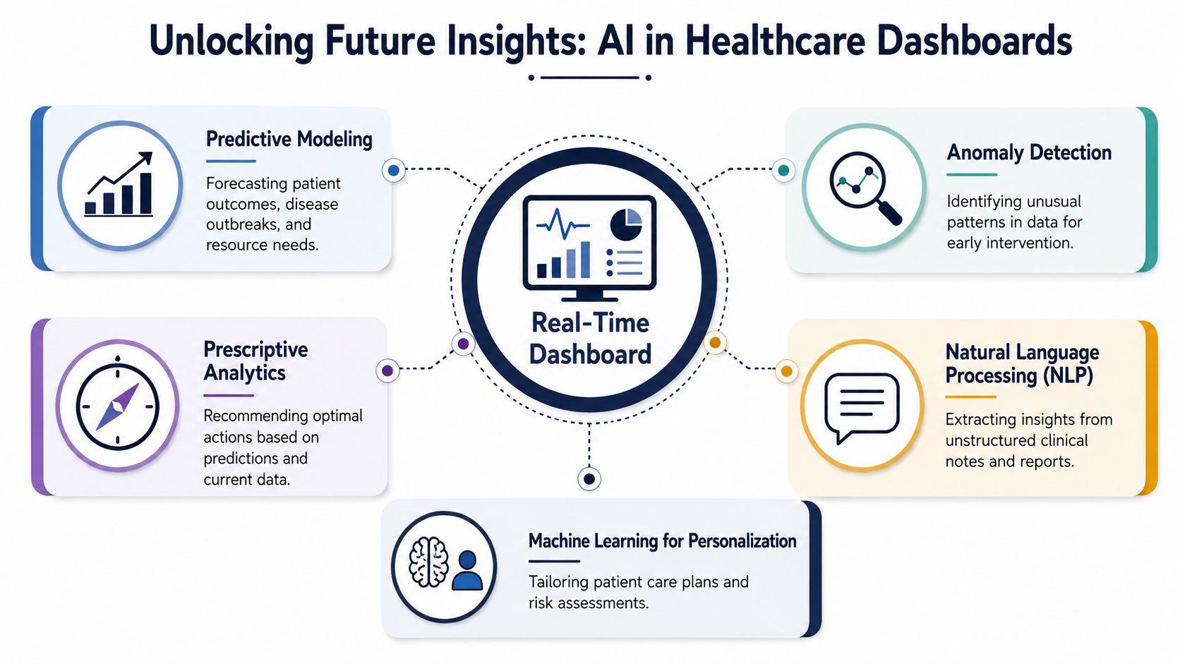
Where predictive models create value
The strongest use cases usually fall into a few categories:
Patient risk prediction: Identifying patients likely to deteriorate based on live vitals and clinical context
Readmission risk support: Flagging discharge cases that may need added review or care coordination
Operational forecasting: Anticipating surges in ED demand, bed constraints, or staffing pressure
Financial pattern detection: Surfacing denial risk, payer anomalies, or claims exceptions earlier
The key is restraint. Not every dashboard needs AI. If a team can act effectively on a descriptive metric, adding prediction may only add noise. Predictive layers work best where there is a clear operational action tied to a forecast.
A practical implementation pattern
Teams usually get better results when they sequence AI work carefully:
Stabilize the data foundation
If timestamps, identities, and event completeness are unreliable, the model will inherit the confusion.Define the intervention
A prediction without a workflow is just an interesting number. Decide who acts, when, and how.Train and validate against real operations
Offline model accuracy is not enough. The model has to fit live care processes and escalation logic.Expose outputs carefully in the dashboard
Risk scores should include context, contributing signals, and threshold behavior. Black-box flags create resistance.Monitor drift and recalibrate
Clinical patterns, workflows, and coding practices change. Models need ongoing review.
As we explored in our guide to an AI implementation roadmap, the value of AI rises when delivery follows a business-first path instead of a model-first one. The same principle applies here.
Organizations building more advanced decision support often combine dashboard delivery with AI development services, enterprise AI solutions, and applied machine learning services so that prediction, workflow integration, and governance mature together.
The model isn't the product. The intervention is.
That distinction matters. A dashboard that predicts deterioration but doesn't route the alert to the right care team at the right threshold hasn't solved the underlying problem.
A Phased Roadmap for Dashboard Implementation
Most real-time dashboard programs struggle for the same reason. Leaders approve the idea based on visible outcomes, then underestimate the integration and governance work required to make those outcomes reliable.
A frequently underexplored angle in the healthcare literature is exactly this operational burden. Real-time value depends on data freshness, normalization, and role-specific views, not just chart design, and the hardest work sits in the integration pipelines for EHR, lab, and claims systems (research gap noted in this healthcare dashboard review).
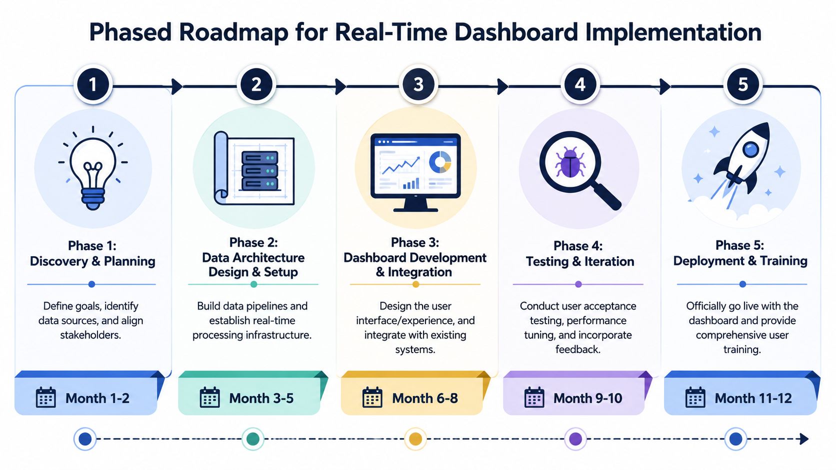
Phase 1 through Phase 3
A workable roadmap usually starts smaller than stakeholders expect.
Discovery and stakeholder alignment
Start by identifying a narrow operational problem with clear ownership. ED flow, staffing coordination, patient leakage, or denial management are common choices because the workflow is visible and the value is easier to validate.
Define:
Primary users
Decisions the dashboard should support
Source systems required
Response expectations when a threshold is crossed
This phase also forces trade-offs. A dashboard for executive visibility is not the same as one for shift-level intervention.
Technology and delivery model selection
Build versus buy is rarely a binary decision. Many organizations buy visualization capability and custom-build the data and governance layer around it.
That's where software development service models matter. Team extension, dedicated teams, or managed delivery each fit different levels of internal maturity. If the dashboard is part of a broader platform strategy, it may also align with SaaS product development rather than a one-off internal tool.
Data governance and pipeline construction
This is the phase that is commonly under-resourced.
The essential work includes:
Source profiling: Understand missing fields, inconsistent codes, and refresh behavior
Normalization logic: Align entities, terms, timestamps, and business definitions
Data quality controls: Catch duplicates, stale feeds, and out-of-range values
Metric governance: Define KPI logic once and reuse it everywhere
Phase 4 and Phase 5
Pilot with real users
Pilot in one environment where users can give blunt feedback. Don't ask whether they “like” the dashboard. Ask whether they changed a decision because of it, whether they trusted it, and what they still had to verify elsewhere.
Useful pilot signals include:
Which tiles get ignored
Which alerts are too noisy
Where drill-down paths break
Which metrics trigger reconciliation disputes
Pilot success isn't “the dashboard loads.” It's “the team changed behavior and didn't revert to spreadsheets.”
Scale rollout and continuous improvement
Once the first workflow proves value, scale by pattern, not by cloning screens. Reuse pipeline standards, permission models, and KPI governance. Adapt the views to the role and context.
At this point, many organizations also formalize reusable assets: semantic models, integration templates, alert logic, and design systems. That's what turns one dashboard project into a durable analytics capability.
Frequently Asked Questions About Real-Time Healthcare Dashboards
McKinsey estimates that as much as 97% of hospital data goes unused. That gap explains why dashboard conversations usually shift fast from design to integration, governance, and trust.
Leaders ask practical questions once they get past the demo stage. The right answers usually have less to do with charting features and more to do with whether the system can handle messy source data, enforce consistent metric logic, and stand up to audit review.
| Question | Answer |
|---|---|
| Are real-time healthcare analytics dashboards worth the investment? | Yes, if they are tied to a workflow where someone can act on the signal in the moment. The return usually shows up in throughput, exception handling, staffing decisions, and denial prevention. The biggest miss is funding the dashboard UI without funding the integration and governance work that makes people trust it. |
| Where do teams usually see value first? | Patient flow, bed management, command center operations, staffing visibility, and revenue cycle exceptions are common starting points. These areas have clear users, frequent decisions, and measurable operational impact. |
| What makes a dashboard truly real-time? | A real-time dashboard runs on low-latency ingestion, timestamp alignment across systems, governed KPI definitions, and clear rules for incomplete or late-arriving data. A screen that refreshes every few seconds is not enough if ADT feeds lag, interface mappings drift, or source systems disagree on status values. |
| Should we start with the enterprise scope? | No. Start with one workflow, one accountable owner, and one set of actions tied to the metrics. That keeps integration risk contained and makes it easier to prove adoption before scaling to more departments. |
| Do we need AI on day one? | No. Start with descriptive and operational metrics that clinicians, operators, and finance teams can validate. Add predictive models after the team has reliable historical data, alert thresholds, and a defined response when the model flags risk. |
| What is the biggest implementation mistake? | Treating the dashboard as the product and the pipeline as plumbing. In practice, delays come from source profiling, terminology mismatches, duplicate records, unclear ownership, and disputes over metric definitions. |
| How should access be controlled? | Use role-based access, minimum necessary exposure, and audit logging tied to user identity. Clinical, operational, and financial users should see different levels of detail, and PHI access should be justified by the workflow, not by convenience. |
A better buying question is not “Can this tool build dashboards?” Almost all modern platforms can.
Ask whether your architecture can keep data fresh, explainable, secure, and consistent across EHR, ADT, RCM, and departmental systems while preserving an audit trail. That is what determines whether teams act on the dashboard or keep reconciling numbers in side spreadsheets.
About Preethi Saro Philip
Preethi Saro Philip is a Post Graduate Research Degree holder in Economics with more than 10 years of experience in writing, editing, research and teaching. She has an intense passion for content crafting and calls herself a ‘wordsmith’. She enjoys writing on wide-ranging topics including business, technology, health & lifestyle, education, environment etc.
View all posts by Preethi Saro Philip →